top of page
Information Website Case Study - Reach for the Horizons
During my design process for this class, I have done many revisions and thanks to the critiques of my peers, I was able to refine my designs.
Some of the critiques I had received were to:
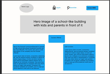
Use the grid tool on Figma to line the boxes,not to contain all the sections in a box and reduce the amount of text and add designs to empty space. My design started out as box-shaped sections on white space and as the process went on, it ended up having more design components, such as: a yellow and blue color scheme, design patterns, and realistic looking imagery.
Here is my site from start to finish:

bottom of page